Rebranding of a Canadian Chocolate Brand & creation of Packaging
Branding Art Direction
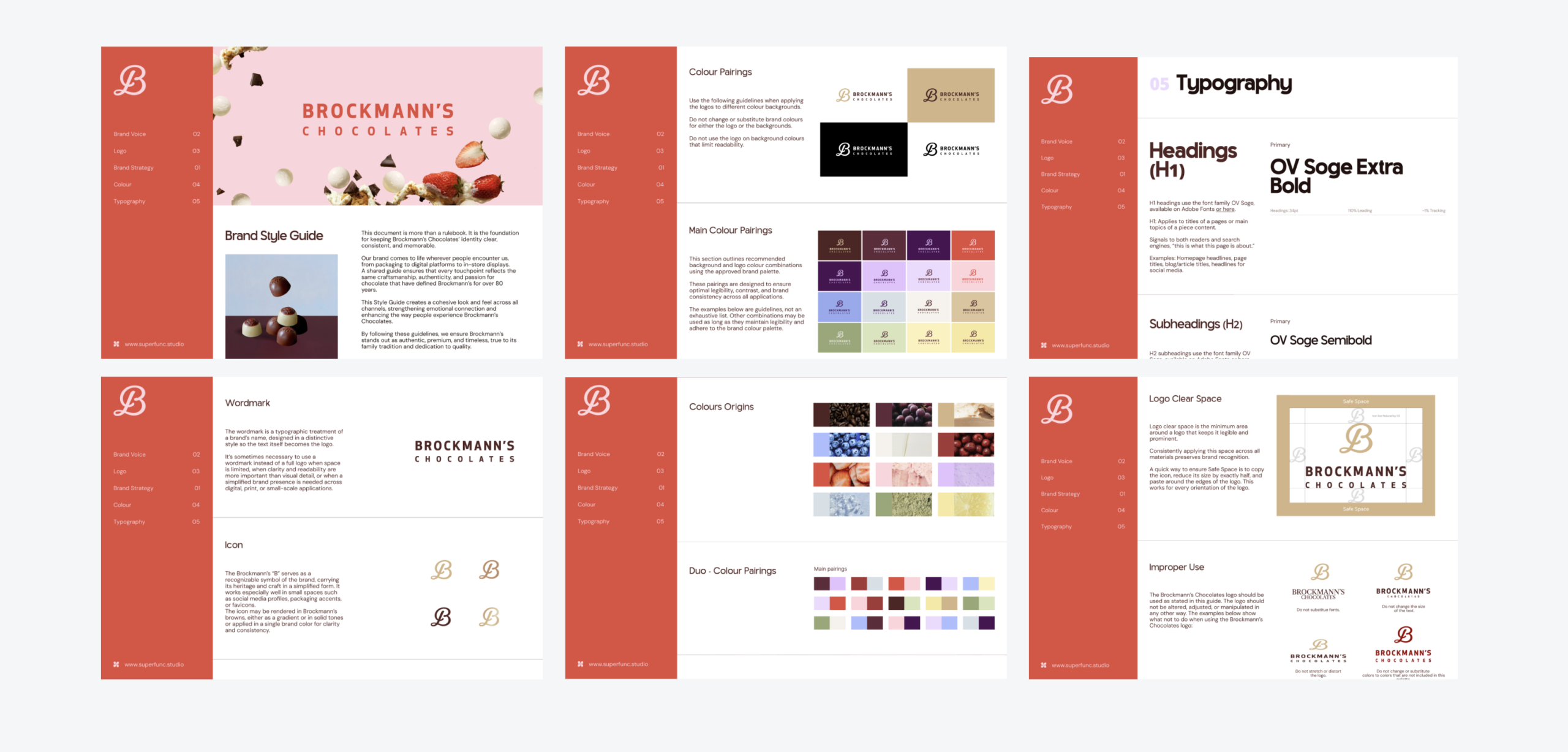
Visual Identity
Packaging
Chocolate Packaging
A new expression
For Brockmann’s rebranding, the challenge was to find the right balance between what makes the brand what it is and how to bring it into a new generation.
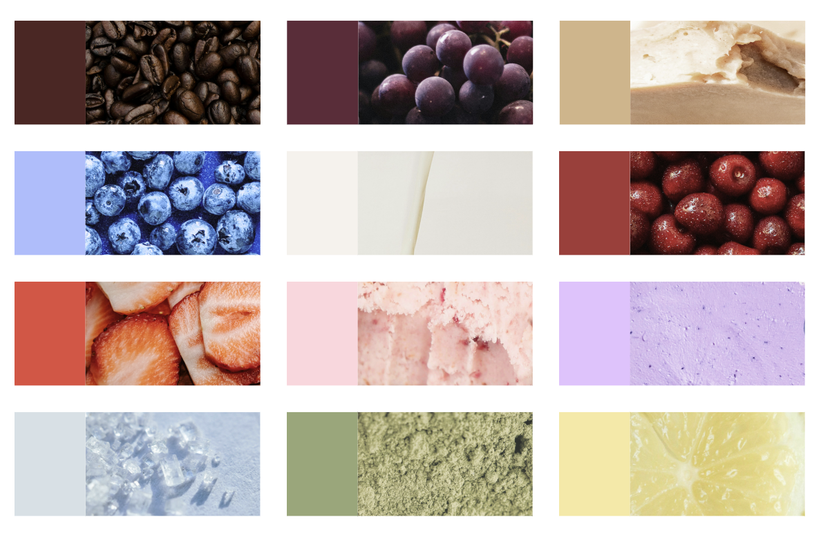
The identity leans into a more confident, colorful, and contemporary language, without losing the craftsmanship and generosity rooted in its heritage. Chocolate remains at the heart of the brand, but its expression becomes freer, more playful, and less conventional.
From identity to packaging
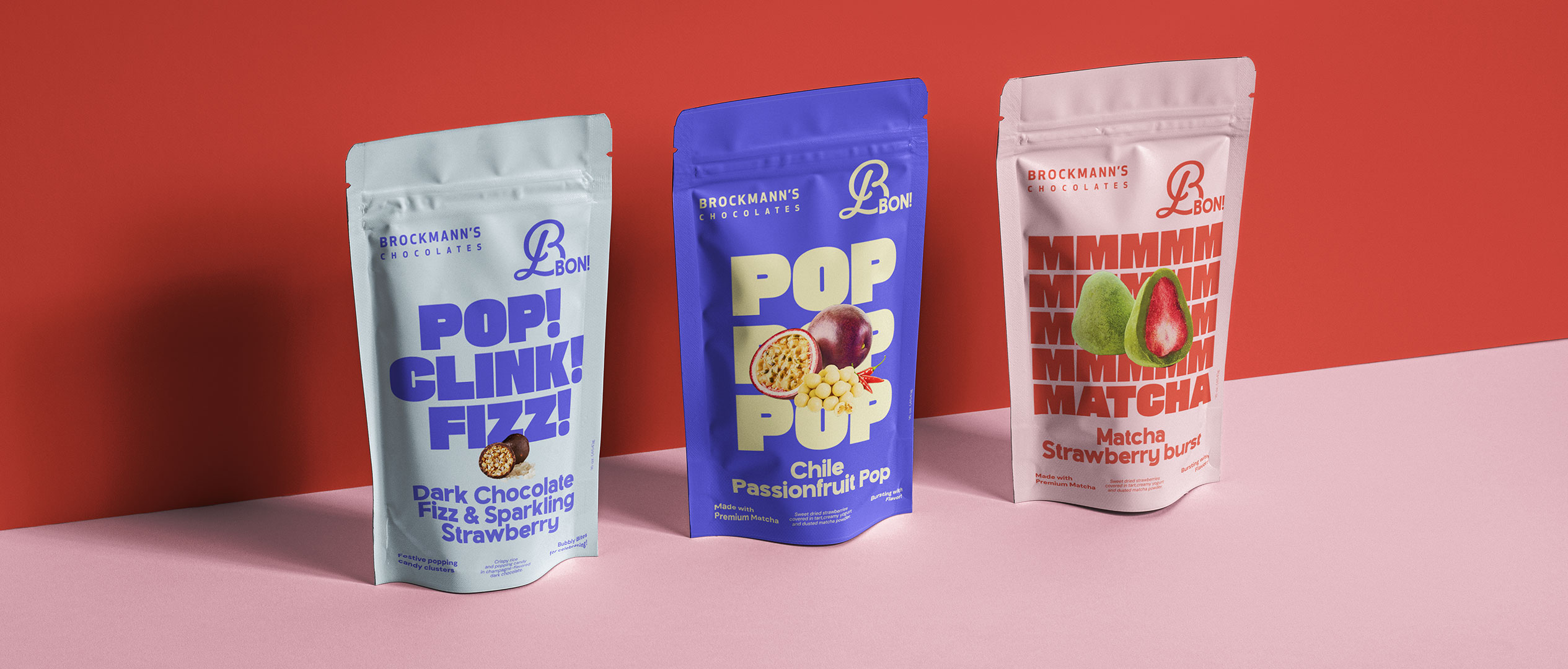
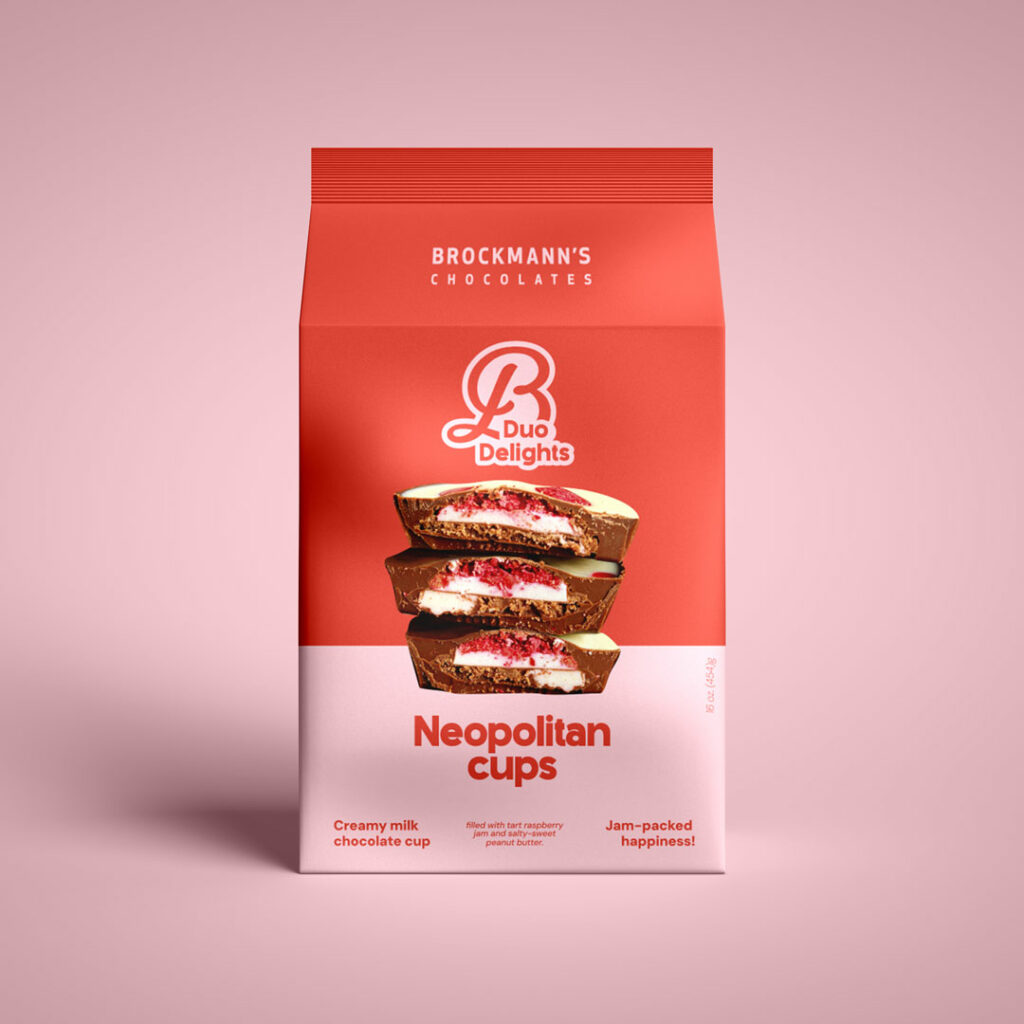
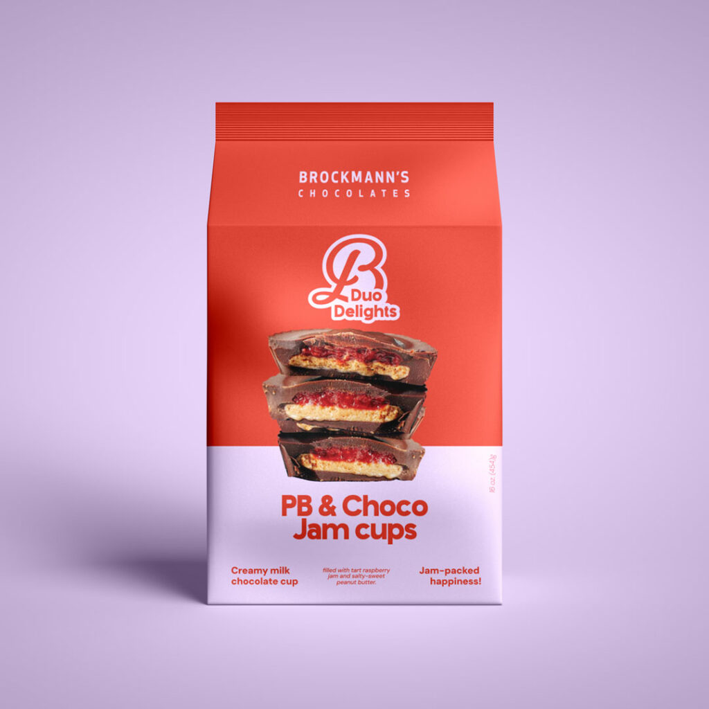
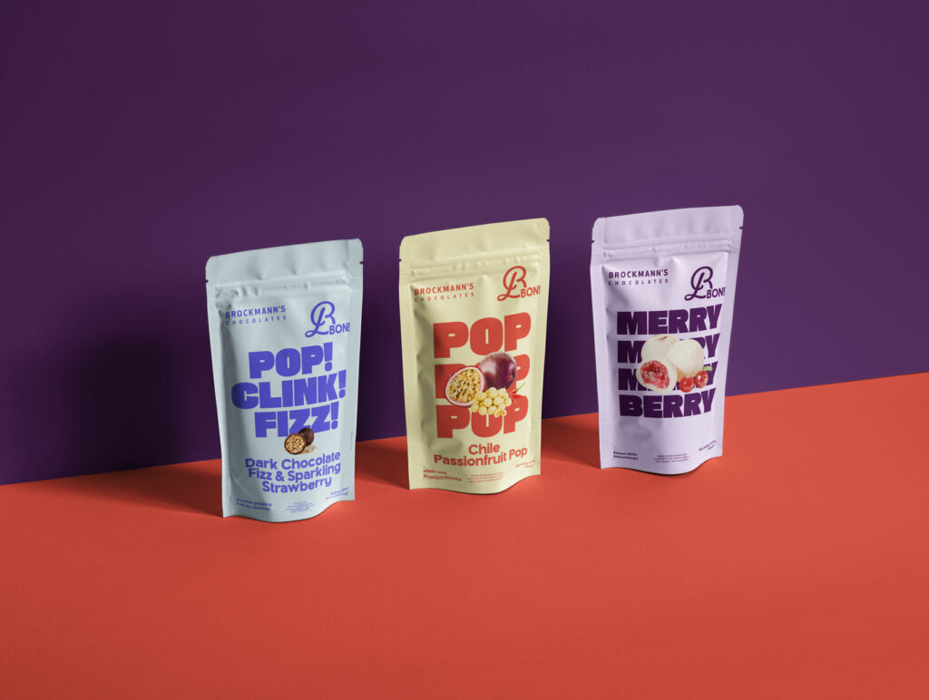
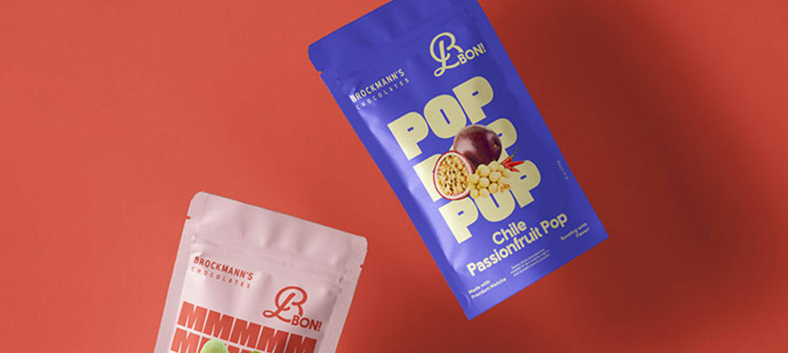
The work then extended into a series of packaging concepts, each designed as a different way of bringing this new personality to life. Rather than simply applying the new visual identity, every concept was built around something specific to the product: an occasion, a flavor combination, or a different way of treating yourself.
A little something for every occasion
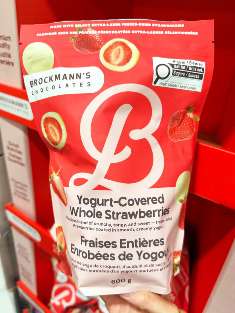
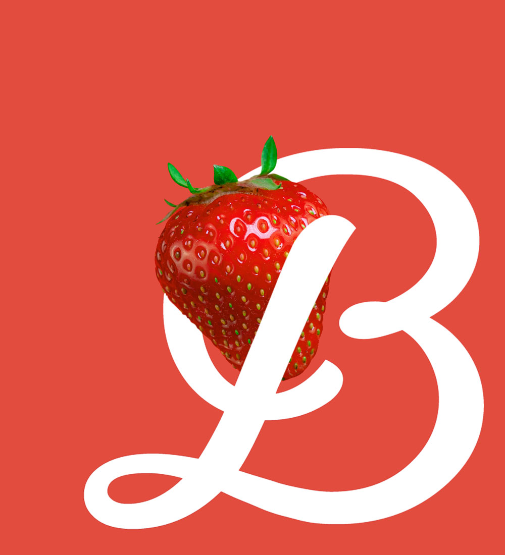
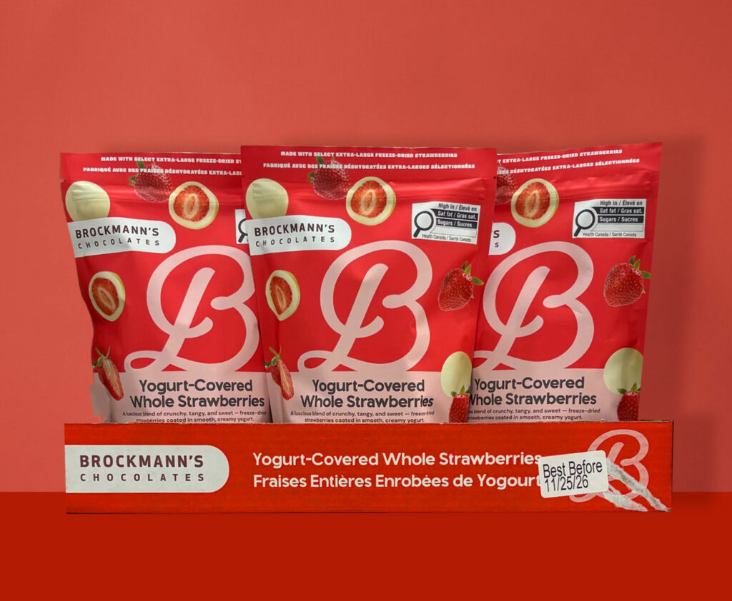
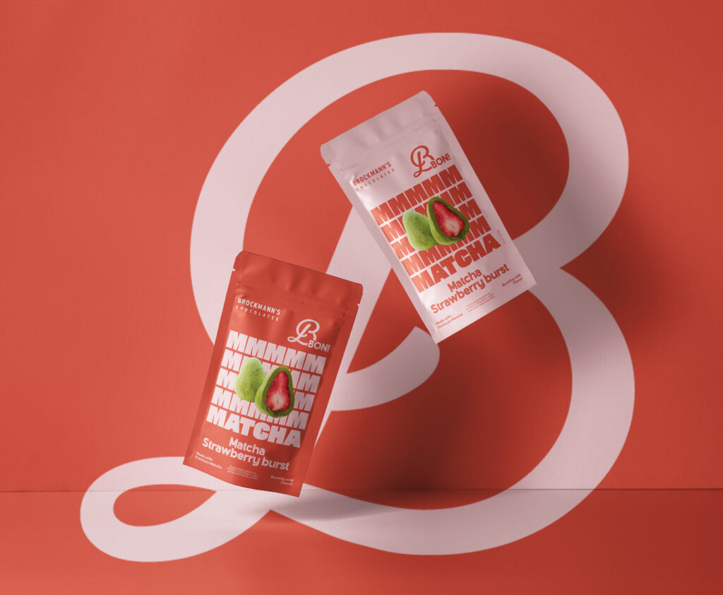
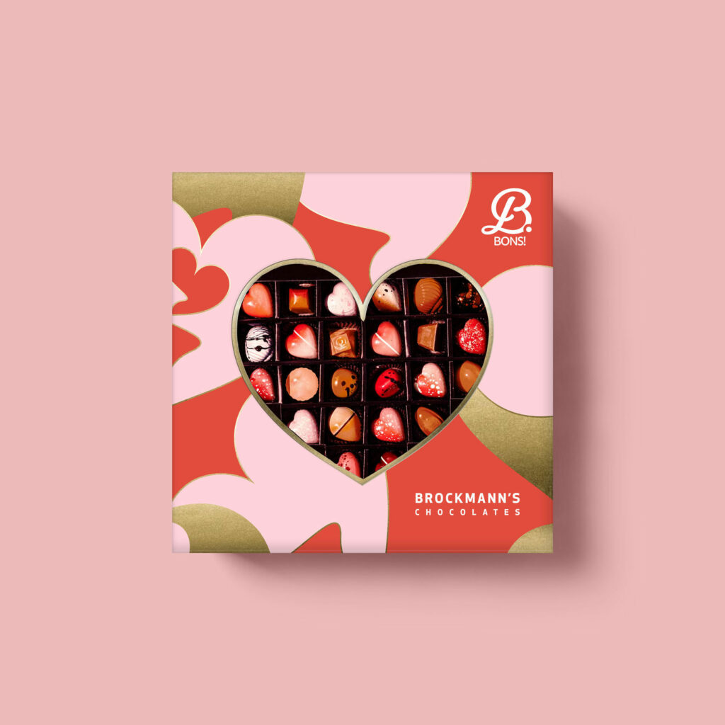
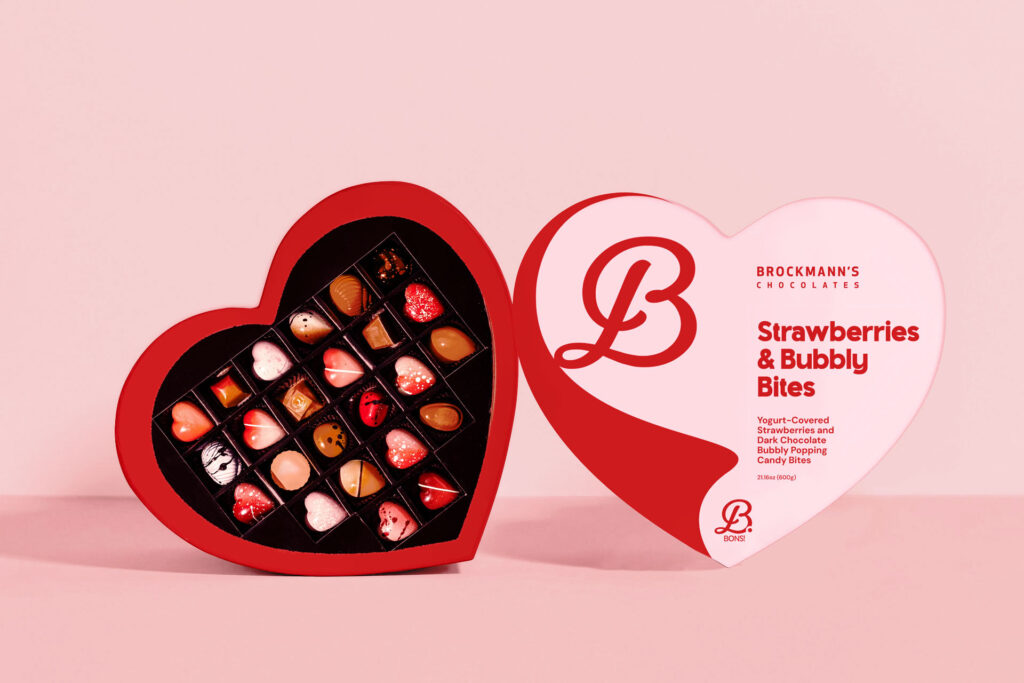
The range explores different occasions, from special editions such as Valentine’s Day to more unexpected flavor combinations. One concept, for example, features a whole strawberry covered in yogurt, turning the product itself into the hero and making the packaging part of the temptation.
Meet B.BOns
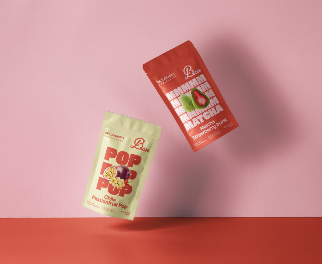
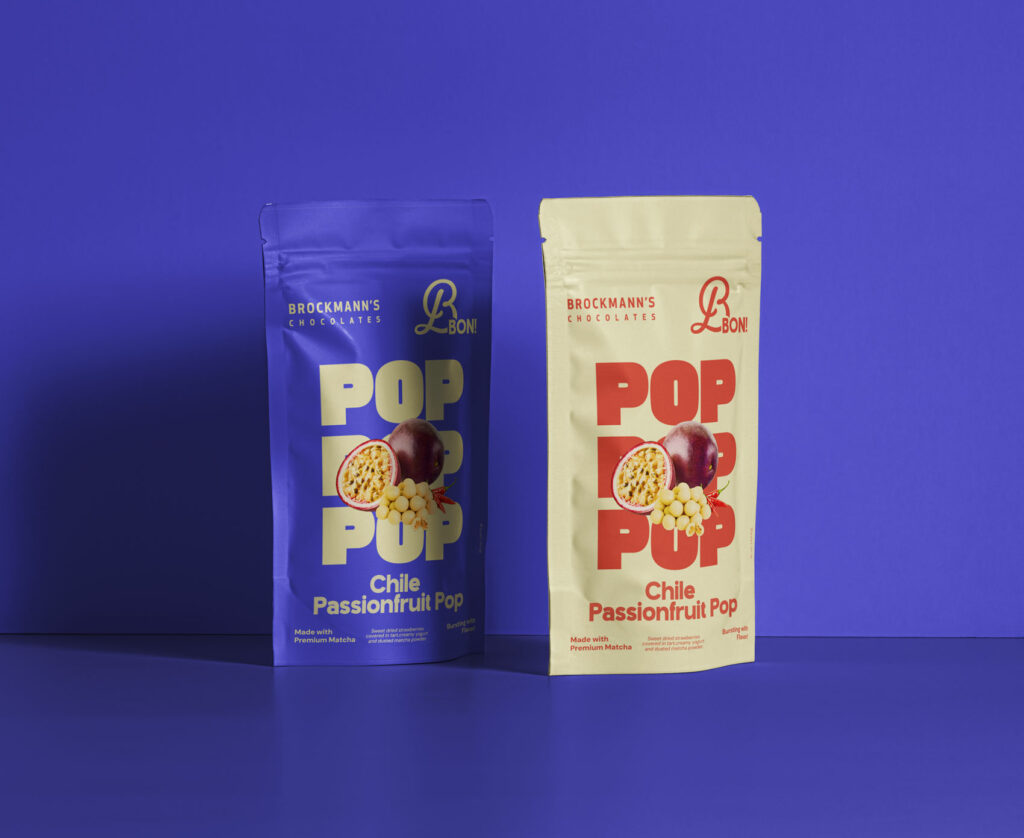
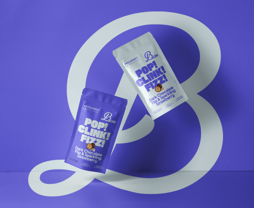
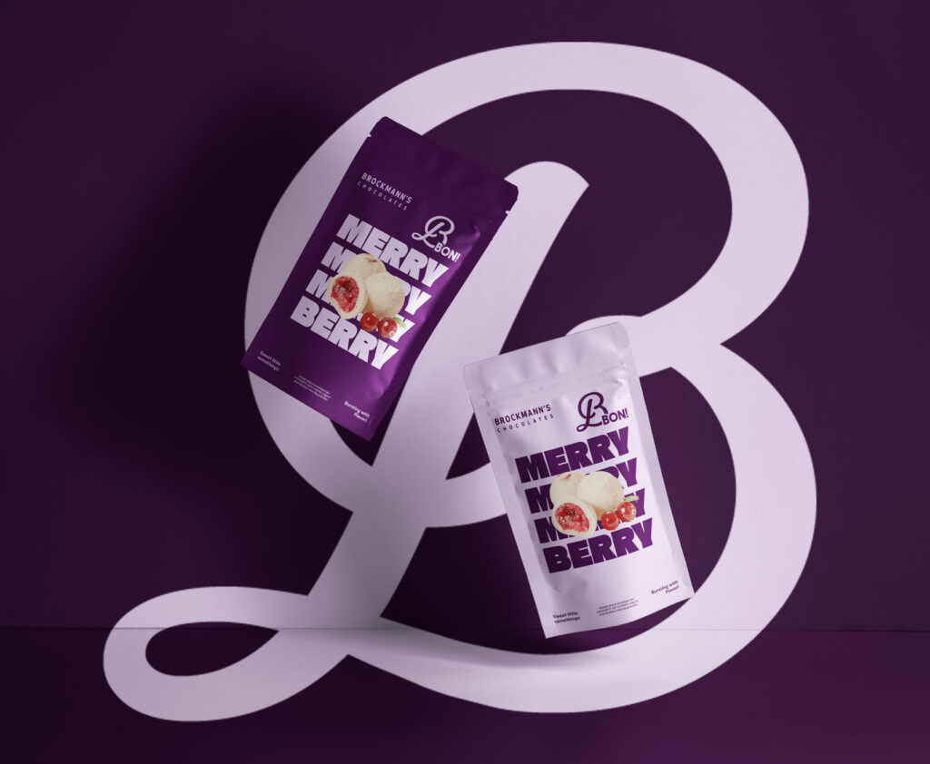
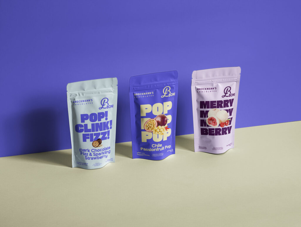
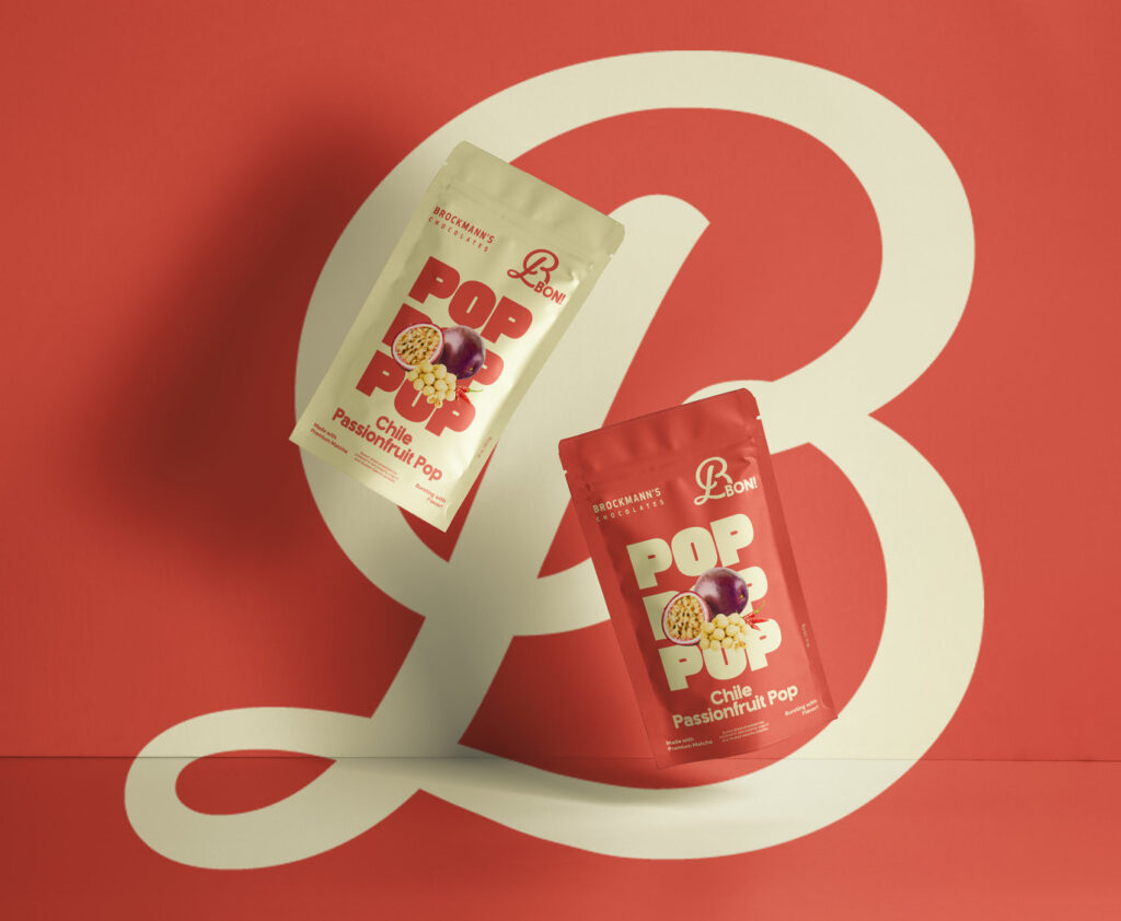
B.BOns was developed as a sub-brand within this new universe, giving some of Brockmann’s more playful creations a space of their own. Its name, logo, and visual language take cues from the main brand while allowing for a little more freedom and personality.
Premium, without taking itself too seriously
The idea was to show that premium chocolate can be made with real care and craftsmanship while still feeling generous, surprising, and approachable.
Old-school craft. New-school treats.
Chocolate Branding & packaging
Rebranding of a Canadian & USA brand: Brockmann’s Chocolates
A new expression
For Brockmann’s rebranding, the challenge was to find the right balance between what makes the brand what it is and how to bring it into a new generation.
The identity leans into a more confident, colorful, and contemporary language, without losing the craftsmanship and generosity rooted in its heritage. Chocolate remains at the heart of the brand, but its expression becomes freer, more playful, and less conventional.
From identity to packaging
The work then extended into a series of packaging concepts, each designed as a different way of bringing this new personality to life. Rather than simply applying the new visual identity, every concept was built around something specific to the product: an occasion, a flavor combination, or a different way of treating yourself.
A little something for every occasion
The range explores different occasions, from special editions such as Valentine’s Day to more unexpected flavor combinations. One concept, for example, features a whole strawberry covered in yogurt, turning the product itself into the hero and making the packaging part of the temptation.
Meet B.Bons
B.Bons was developed as a sub-brand within this new universe, giving some of Brockmann’s more playful creations a space of their own. Its name, logo, and visual language take cues from the main brand while allowing for a little more freedom and personality.
Premium, without taking itself too seriously
The idea was to show that premium chocolate can be made with real care and craftsmanship while still feeling generous, surprising, and approachable.
Old-school craft. New-school treats.
Art-director & Designer: Audrey Boiteux
Project Management, Art direction, Web design : Hayley Kirkman
Year: 2025
Art Director & Designer: Audrey Boiteux
Project management, Art direction, Web design: Hayley Kirkman






 Les Papeteries –