Open Net is a Swiss Odoo integrator helping businesses simplify, structure and optimise their digital operations. Its mission is to make complex systems clearer, more efficient and easier to manage, combining technical expertise with a deep understanding of each client’s business.
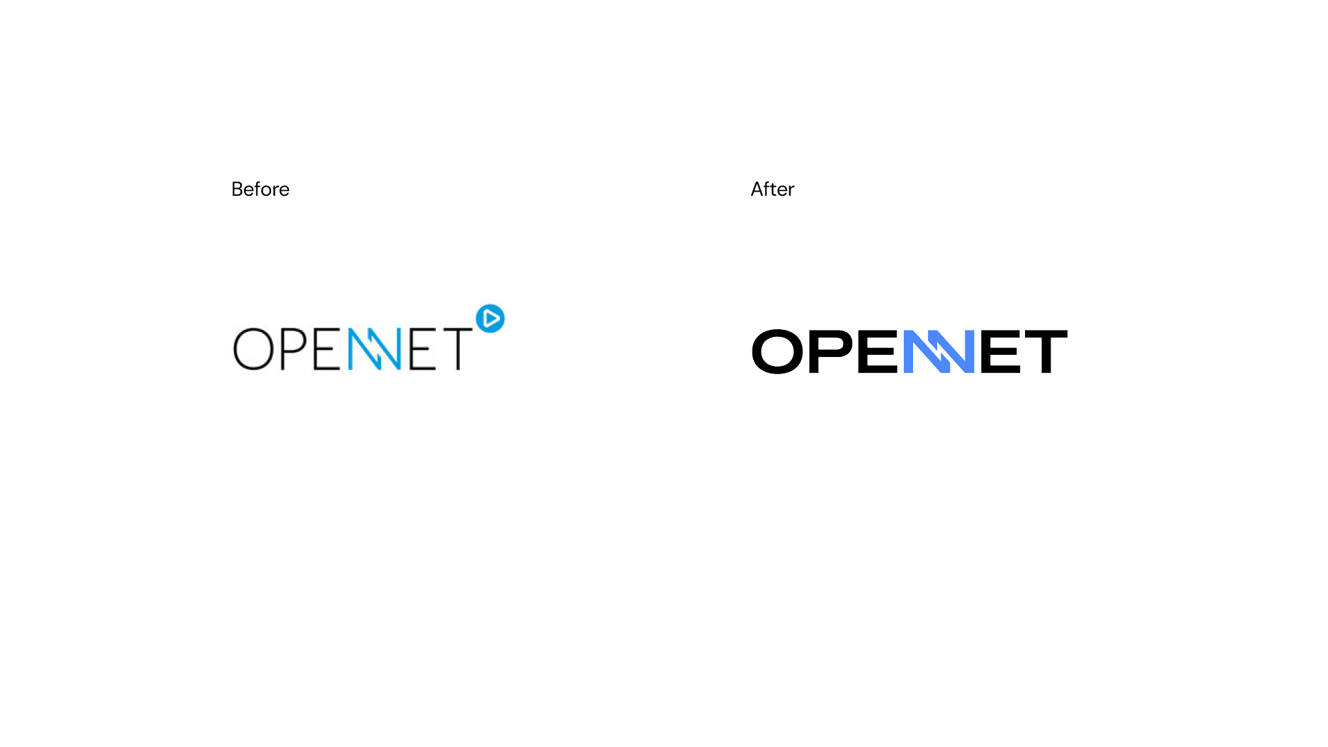
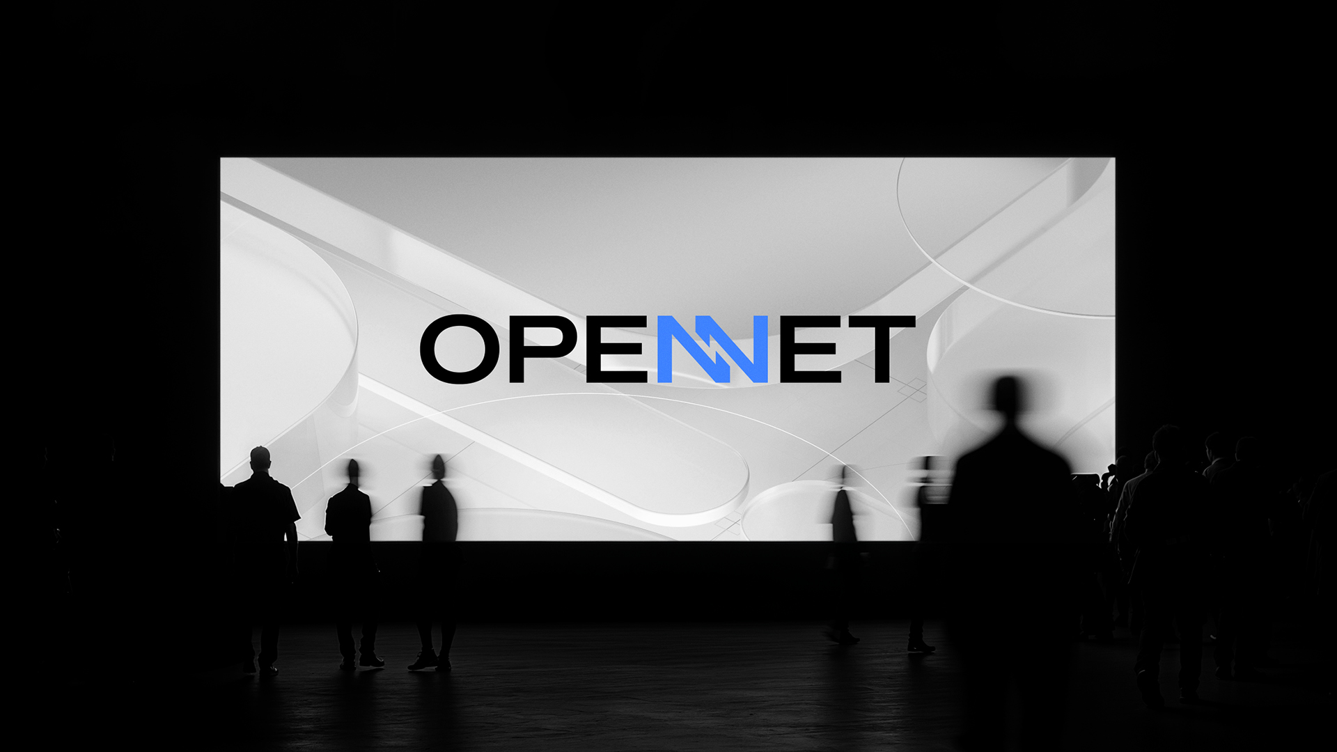
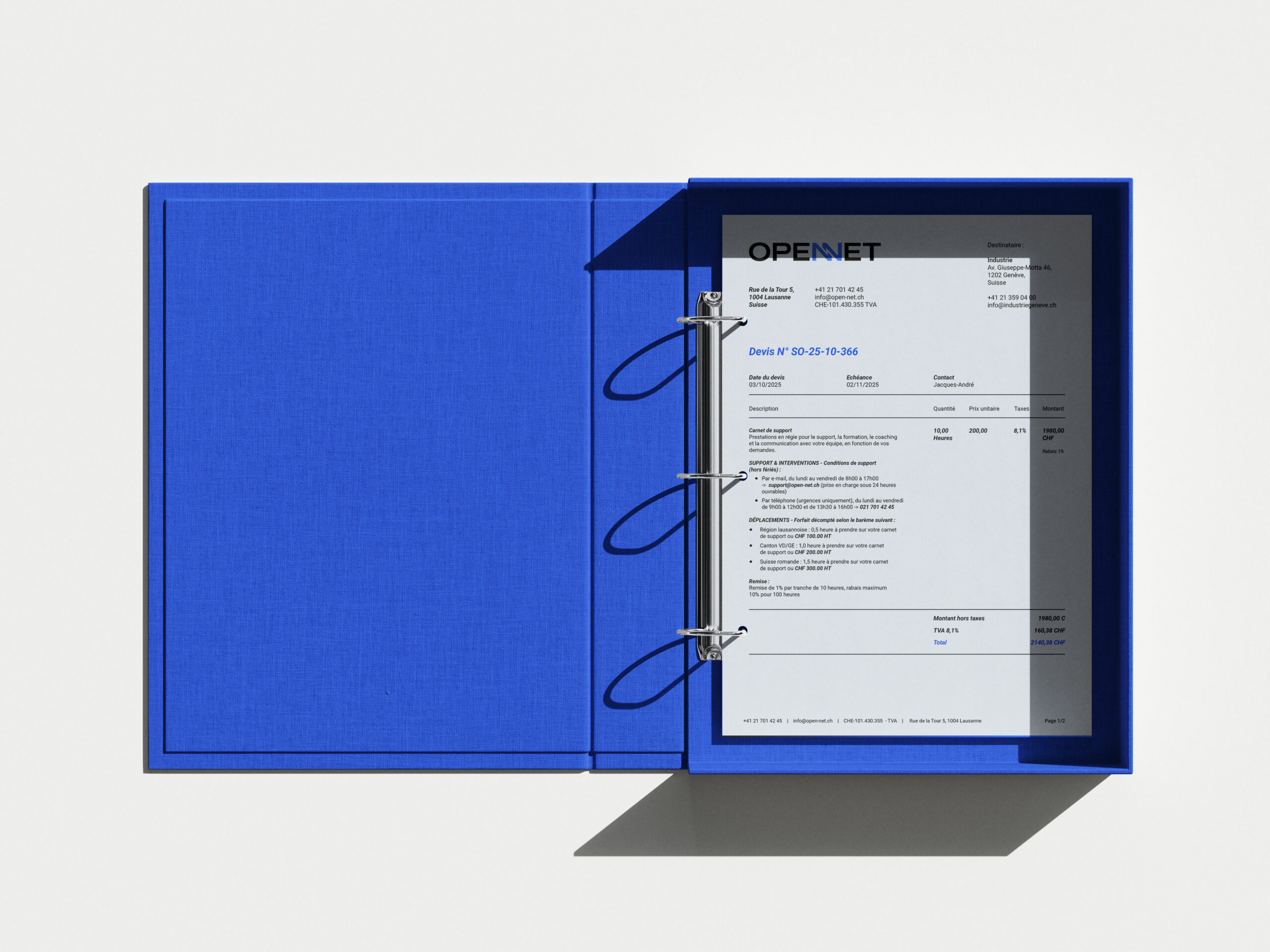
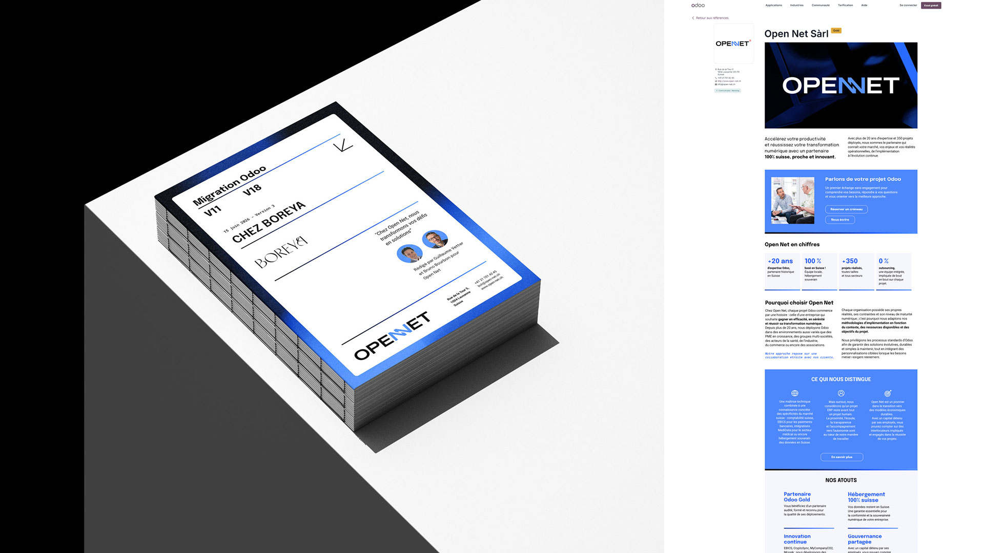
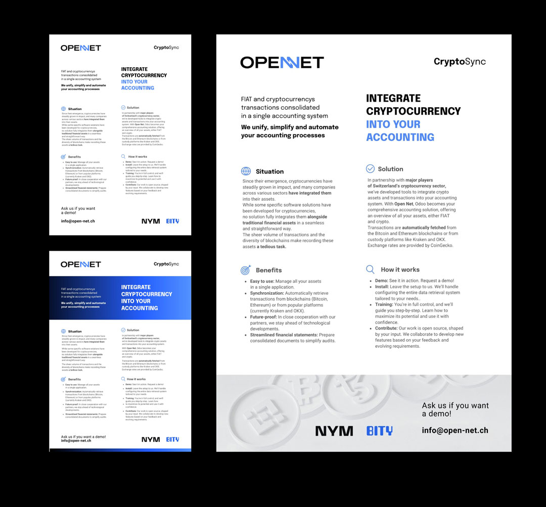
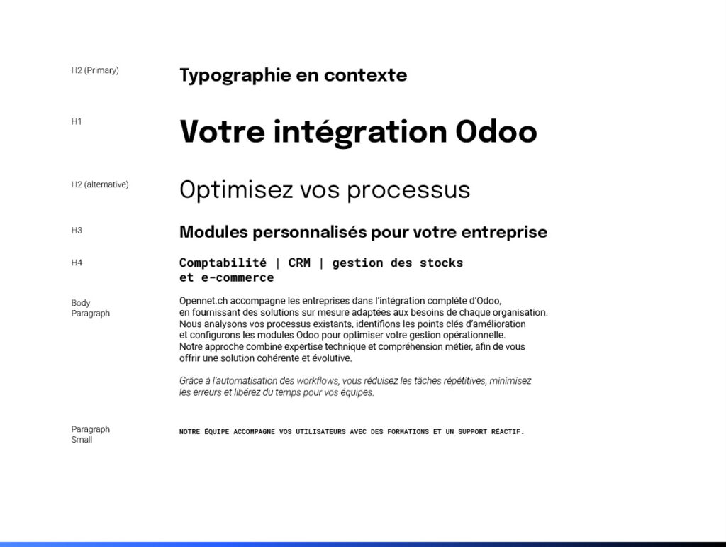
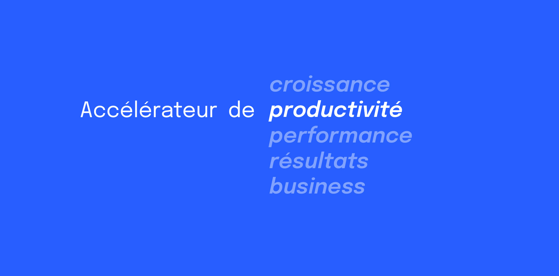
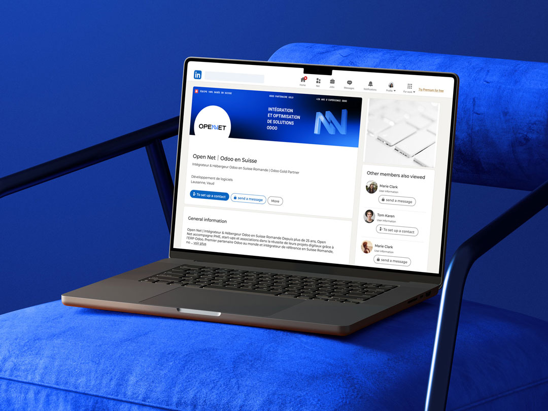
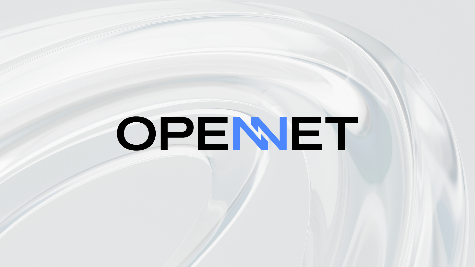
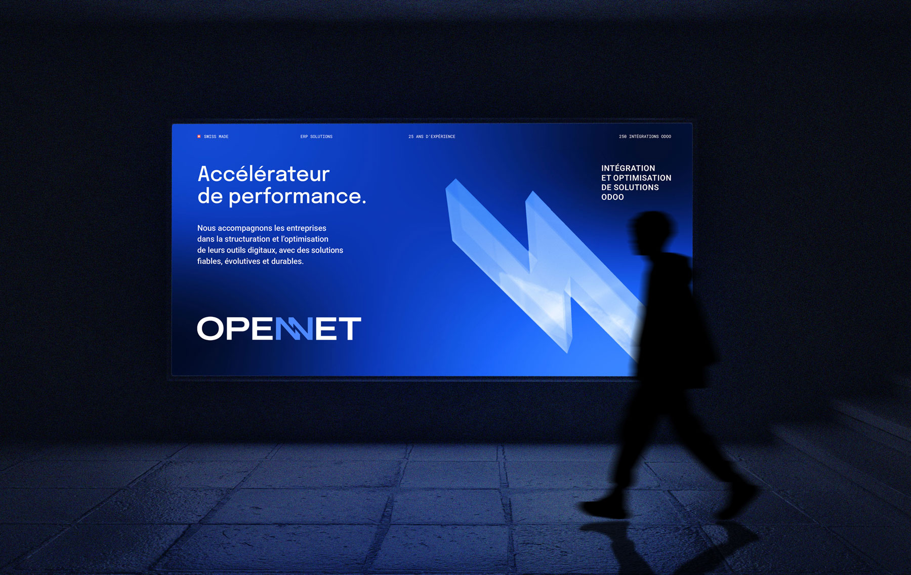
The new visual identity modernises Open Net’s image and anchors the brand more firmly in the digital and technological world. The graphic system combines geometric forms, a contemporary typographic language and a dynamic visual expression to reflect the company’s expertise, precision and ability to simplify complexity. The result is a more distinctive, digital-first identity that feels both innovative and approachable, positioning Open Net as a trusted partner and an accelerator of performance.
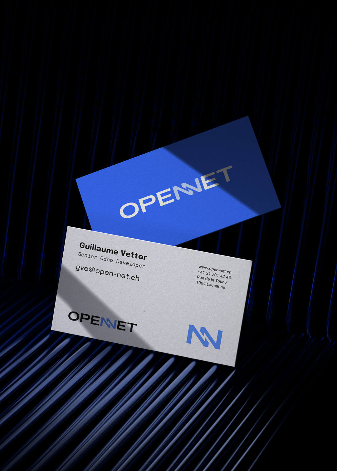
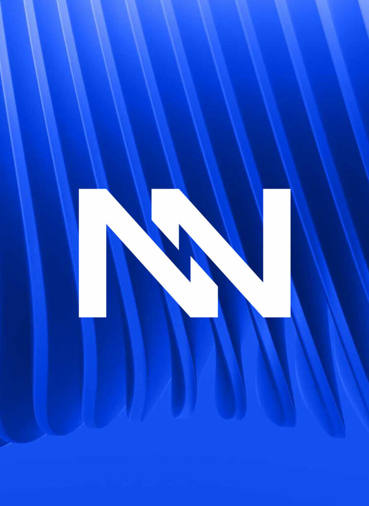
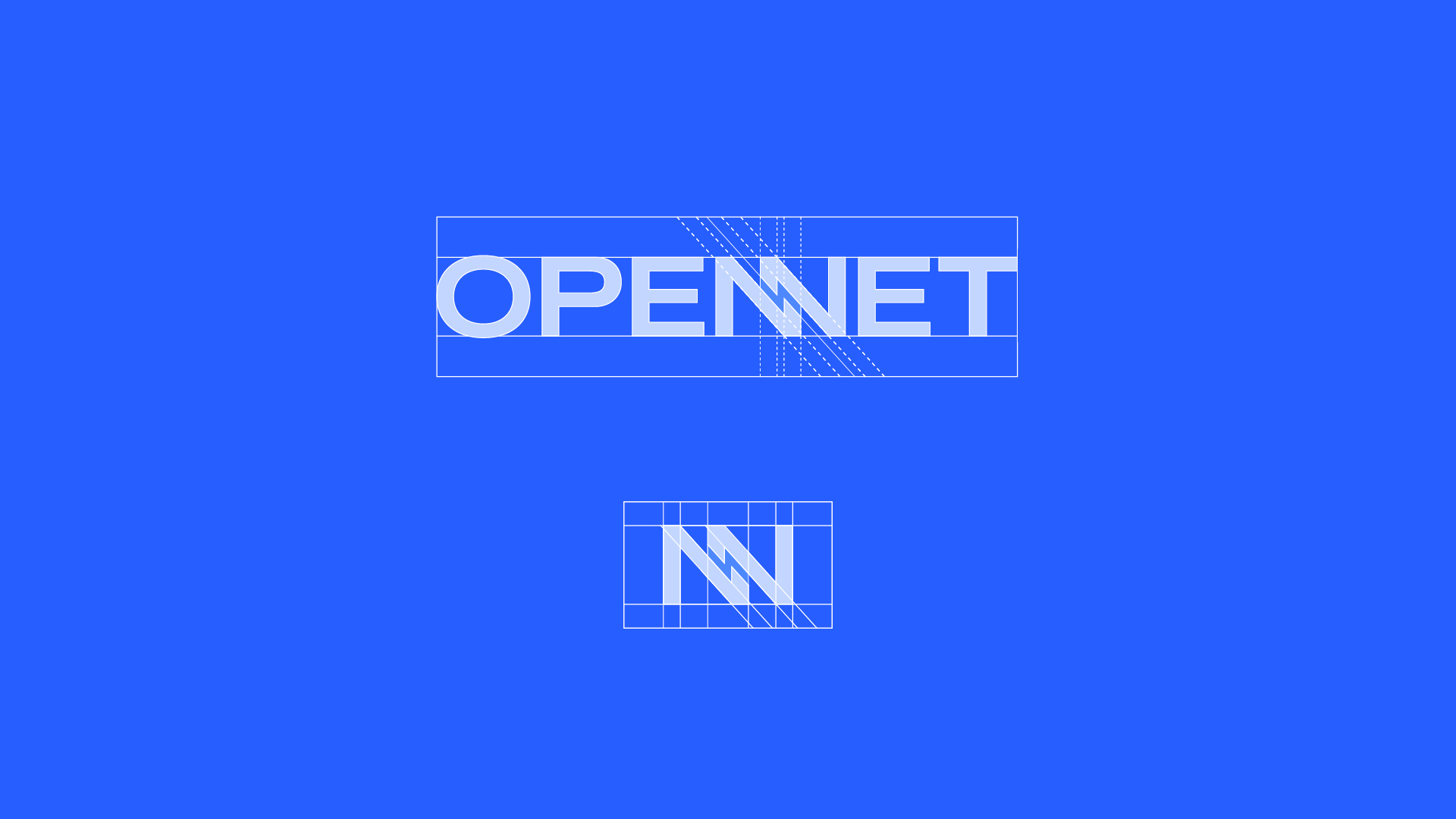
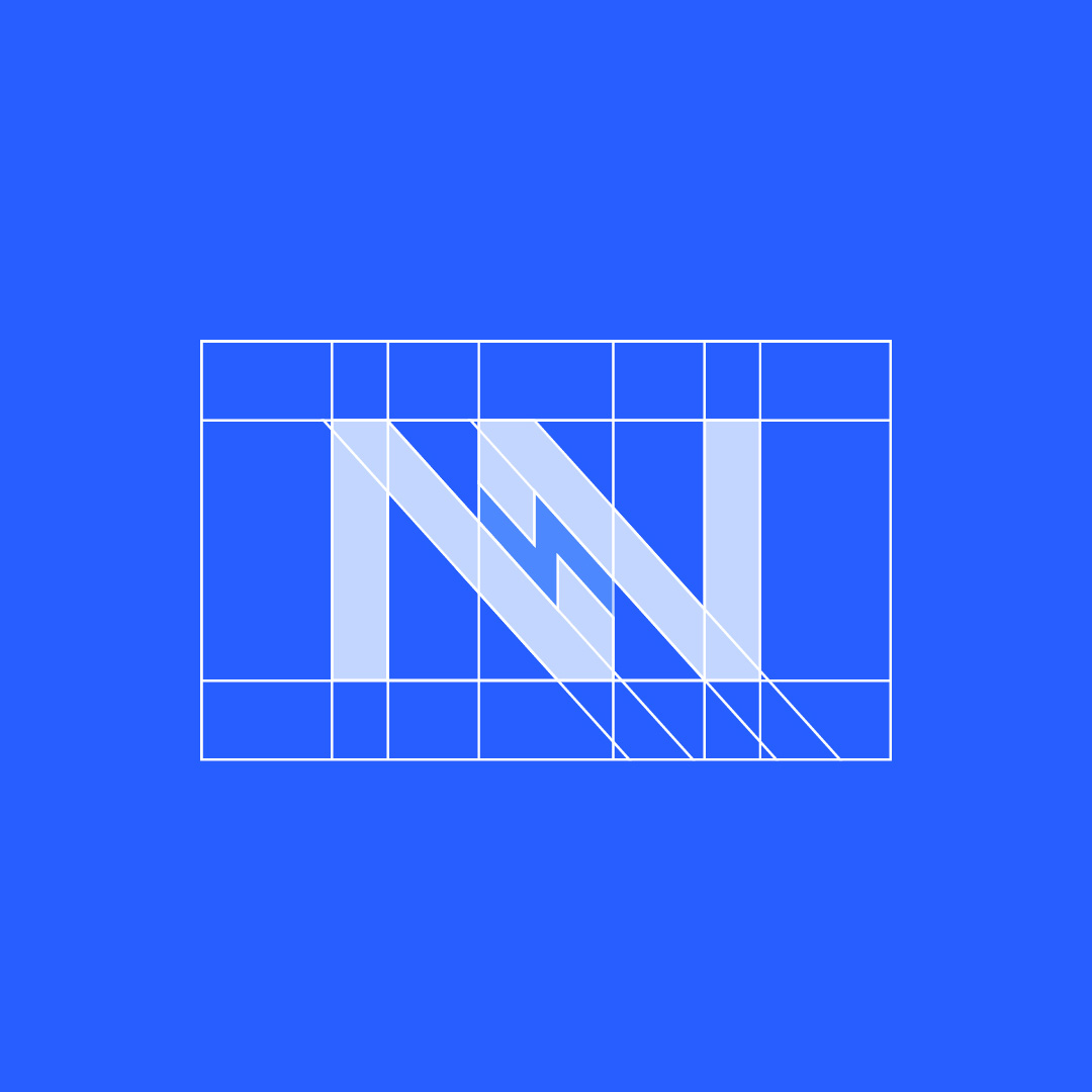
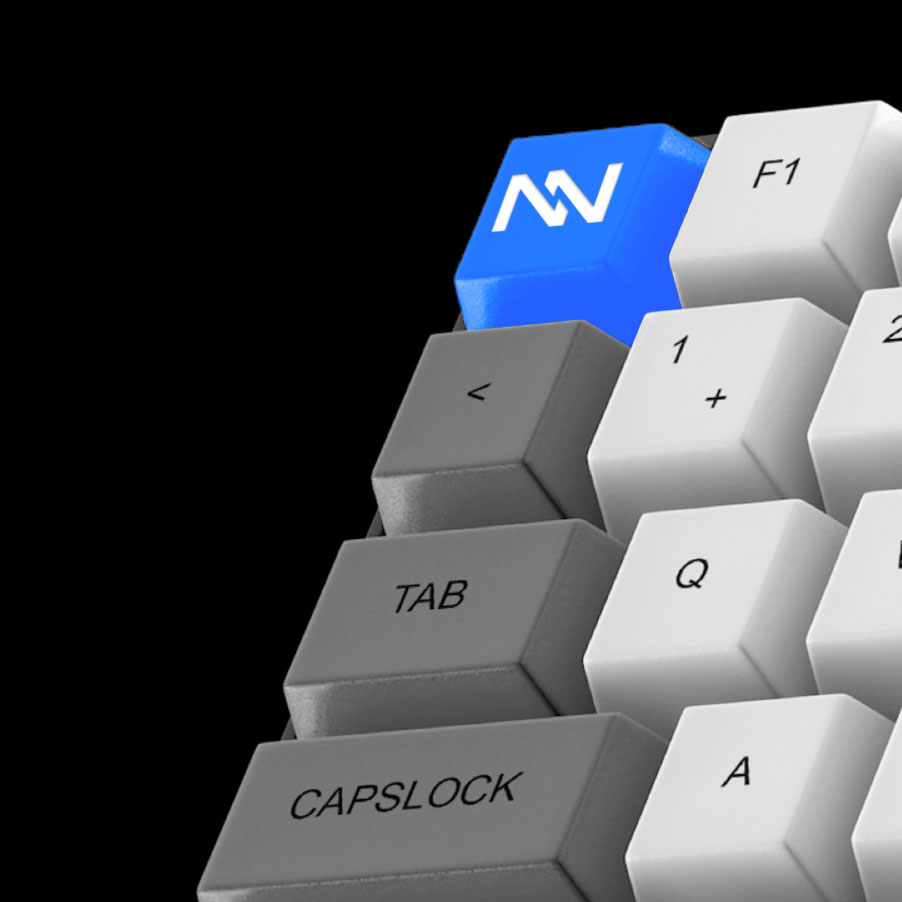
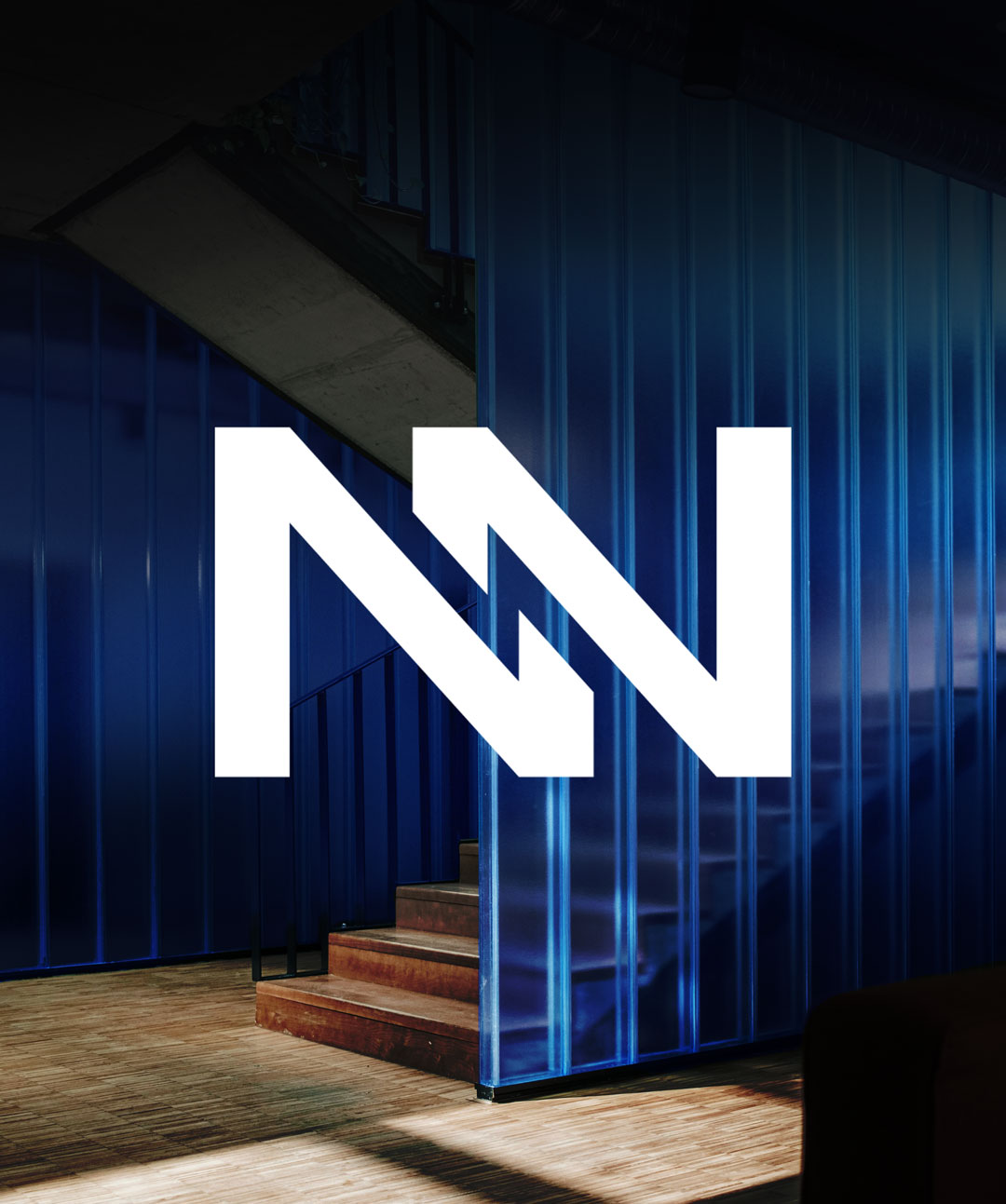
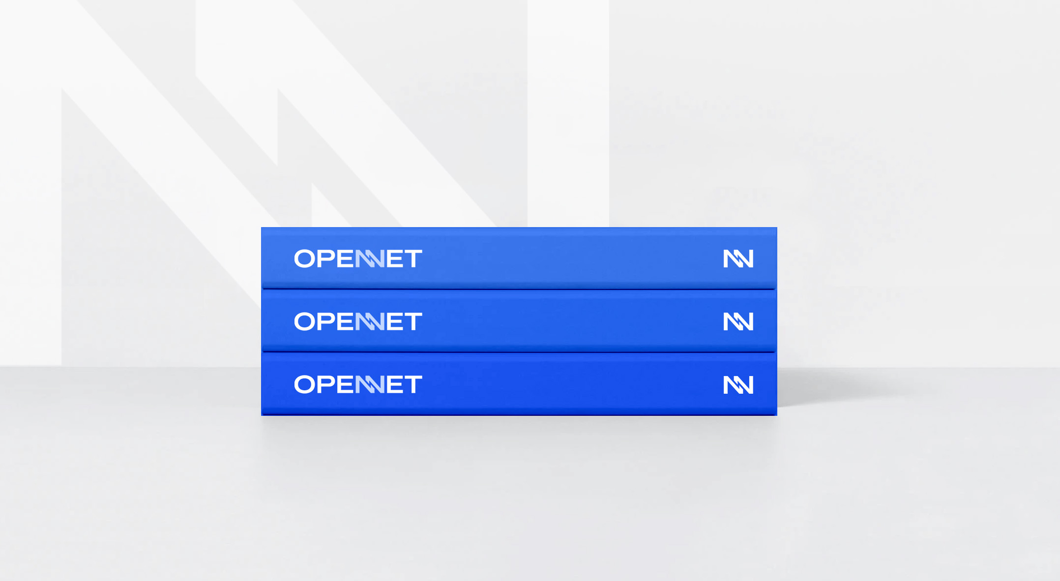
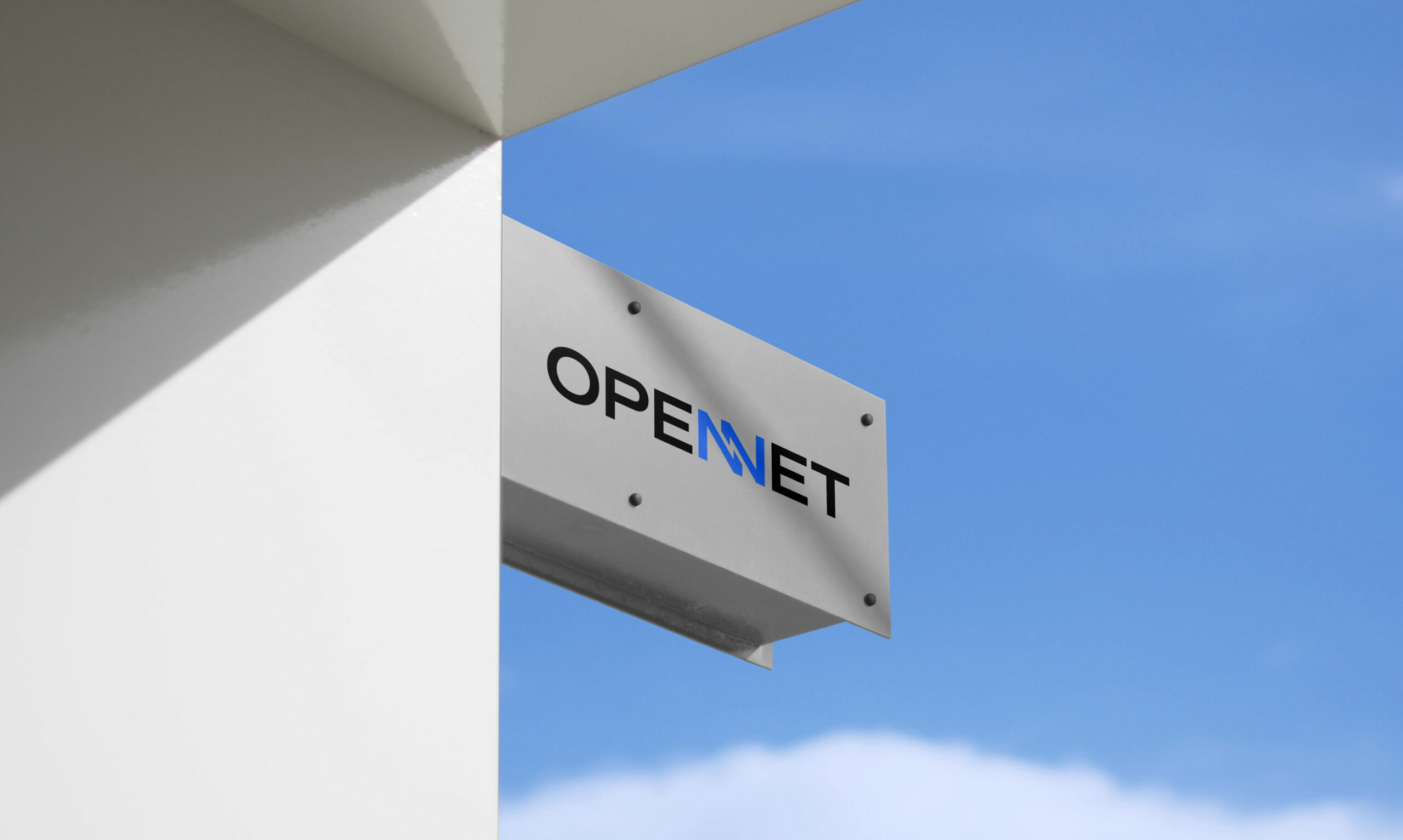
The emblem is built around a reinterpretation of the two “N” letters from the Open Net name. Their geometric construction creates a strong and recognisable shape, expressing structure, precision and stability while reflecting the company’s technical expertise.
At the centre, the negative space forms a lightning bolt, introducing movement and energy into the geometric structure. It represents speed, efficiency and performance, reflecting Open Net’s role in helping businesses accelerate their processes and simplify complex digital environments.
The contrast between the structured N’s and the dynamic lightning bolt creates the core of the visual concept: structure meets movement. The emblem expresses Open Net’s ability to bring clarity and efficiency to complexity, while giving the brand a distinctly contemporary and digital character. It embodies a brand that transforms complexity into momentum, helping businesses move forward with greater speed and confidence.
Open Net
Rebranding of Open Net’s Visual Identity
Open Net is a Swiss Odoo integrator helping businesses simplify, structure and optimise their digital operations. Its mission is to make complex systems clearer, more efficient and easier to manage, combining technical expertise with a deep understanding of each client’s business.
The new visual identity modernises Open Net’s image and anchors the brand more firmly in the digital and technological world. The graphic system combines geometric forms, a contemporary typographic language and a dynamic visual expression to reflect the company’s expertise, precision and ability to simplify complexity. The result is a more distinctive, digital-first identity that feels both innovative and approachable, positioning Open Net as a trusted partner and an accelerator of performance.
Art Director, Graphic Designer & Motion Designer: Audrey Boiteux
Project Management, Copywriting, Communication Strategy: Anna-Lou Bouvet – DEAR AL
www.dearal.fr
Year: 2026
Art Director, Graphic Designer & Motion Designer: Audrey Boiteux
Project Management, Copywriting, Communication Strategy: Anna-Lou Bouvet – DEAR AL www.dearal.fr











 Les Papeteries –